Crowdfunding has become a popular method for entrepreneurs to raise funds for their projects. One of the most popular platforms for crowdfunding is Indiegogo. However, simply launching a campaign on the platform doesn’t guarantee success. To achieve your funding goals, you need to optimize your Indiegogo campaign to maximize visibility and engagement. In this blog post, we will outline eight effective ways to optimize your Indiegogo campaign and increase your chances of success. Whether you are new to crowdfunding or a seasoned pro, these tips will help you take your campaign to the next level.
Set Your Campaign Goal
Your goal is one of the most important elements of your campaign. It’s the primary method of setting expectations with your backers and can be a great tool for creating urgency. Ideally, your goal should be the minimum needed to deliver your perks. The exact numbers are to be determined and adjusted based on the product, however in general we recommend choosing a goal that can be 30% funded within 24 hours of launch. These backers will likely be from your close network.
Hot tips:
- Not sure how to work the numbers? Download the Indiegogo Crowdfunding Calculator and see for yourself how many leads you should collect before you launch to hit your desired goal!
- To boost your campaign’s momentum, aim to hit 100% of your total funds raised within the first 24 hours! The sooner you’re able to reach 30% of your goal, the easier it will be to maintain that momentum later on in the campaign. As the funding progress bar is one of the first things visitors see on the page, we’ve noticed that campaigns have an easier time converting new viewers after reaching 30% of their funding goal, as they already have the benefit of social validation from the crowd.
Design optimal Campaign Page (above-the-fold):
When launching your Indiegogo campaign, it is essential to create an attractive and informative campaign page. It should be designed to capture the attention of potential backers and turn them into actual supporters. When designing an effective campaign page, it is important to focus on optimizing what is above-the-fold– that is, the portion of your page that is immediately visible before any scrolling or navigation occurs. Enhancing this area can grab people’s attention and increase the chances of gaining backers.
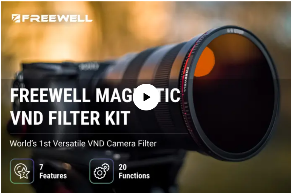
Video Overlay Image
The video overlay image should include a clear image of your product, as well as enough context to explain what the product does without being too busy. Consider adding some of the unique features/benefits of the product. Here are some examples:

Eye-Catching Campaign Card
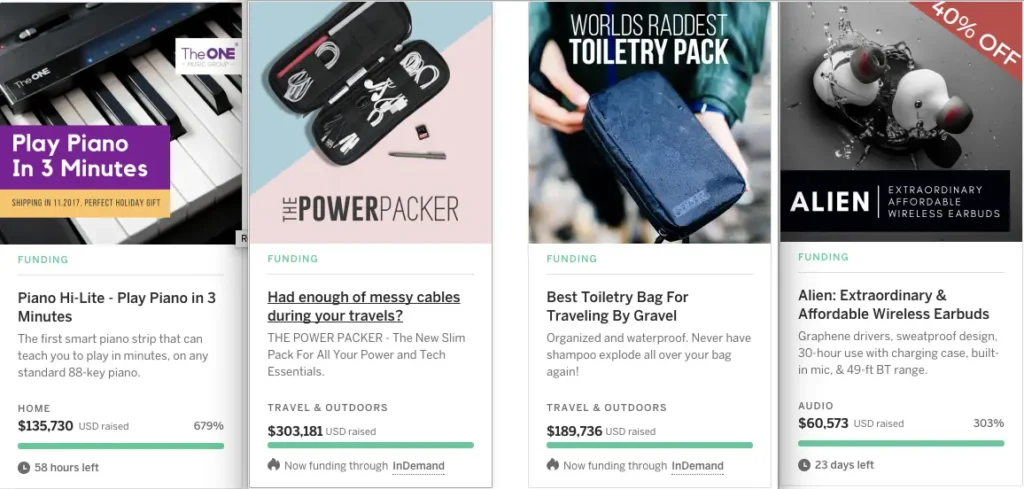
You should make sure to include a visually appealing campaign card. As the card is your “pitch image” across the Indiegogo page search results, it is important to have a good design that will give incentives for people to “click”, such as a discount sign, a benefit tagline, and so on. Additionally, the card should include a short, punchy headline and vivid imagery that captures the purpose and spirit of your campaign. On top of that, it should provide a clear call to action and link viewers to other parts of the page. Below are a few good examples of campaign card design:
Recommended Page Format Guideline
Give Your Campaign Page Room to Breathe
There is a lot of imagery on the campaign page making it busy. The best way to break up content will be spaces. Crowdfunding experts at Rainfactory recommend adding gaps between sections for negative space to give the campaign story some breathing room.
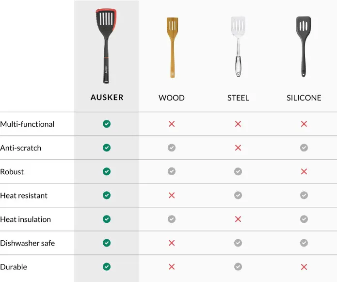
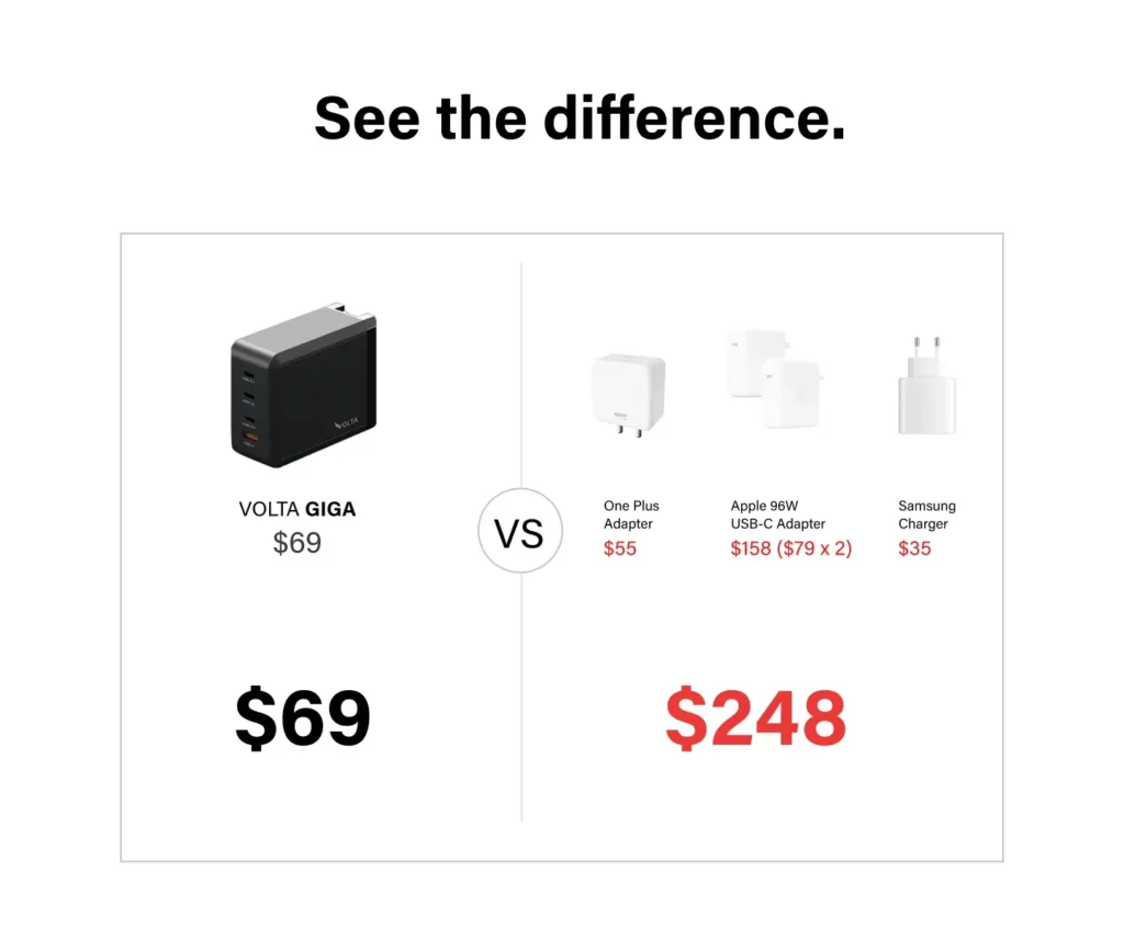
Add a Comparison Chart
Now that you’ve ensured your campaign page is well formatted with the right amount of information and spaces in between, you have almost everything you need for a successful crowdfunding campaign page. One thing left to do is to add a Comparison Chart. Your backers are most likely aware of competing solutions, and if not, will probably want to research what’s already on the market before jumping to back a crowdfunding campaign. Showcase how your product is better than the competition to help backers make a buying decision. Here are some examples:
Perk Strategy
When creating perks, it’s important to keep the pricing structure simple at launch. Backers can only claim one perk at a time, so a simple, easy-to-understand perk structure will go a long way in helping them avoid choice paralysis. You should then plan to introduce new accessory perks, bundles, and upgraded versions of your product as the campaign progresses. Here’s what Rainfactory Crowdfunding Experts recommend:
- Perk Image: Build on your current perk images. Include all items in image format. These are all the items you’ve stated are included in the perks. Here is an example:
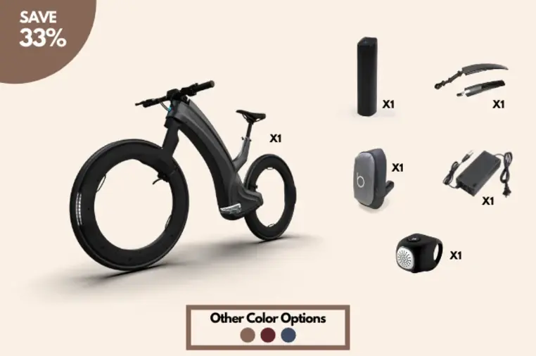
- Perk Quantity: Starting with 2 to 10 is a good number. If you would like to go higher, limit the number available to no more than 100 so that there is a sense of urgency to get a perk before it sells out. Then gradually increase the number available if you’d like to continue selling at that price point.
- Secret Perks: Secret perks are only available for visitors via a unique link that you distribute. This secret perk will show at the top of the perk list (above the Featured Perk) and is also a good way to create an exclusive perk for a particular audience.
- Add-on Perks: Campaigners have the option to add extra perks to their publicly available perks through Add-on Perks. This is a highly recommended step, as campaigns offering perks raise an average of 143% more than campaigns without perks according to Indiegogo. Backers are able to see the add-on perk when they go through the checkout process, leading to more chances of conversion.
We hope this blog quenches your thirst for knowledge when it comes to optimizing your Indiegogo campaign! Are you ready to take your campaign to the next level? Contact us today, and download our free e-book: The Definitive Crowdfunding Handbook & Launch Checklist. Happy crowdfunding! 🙂